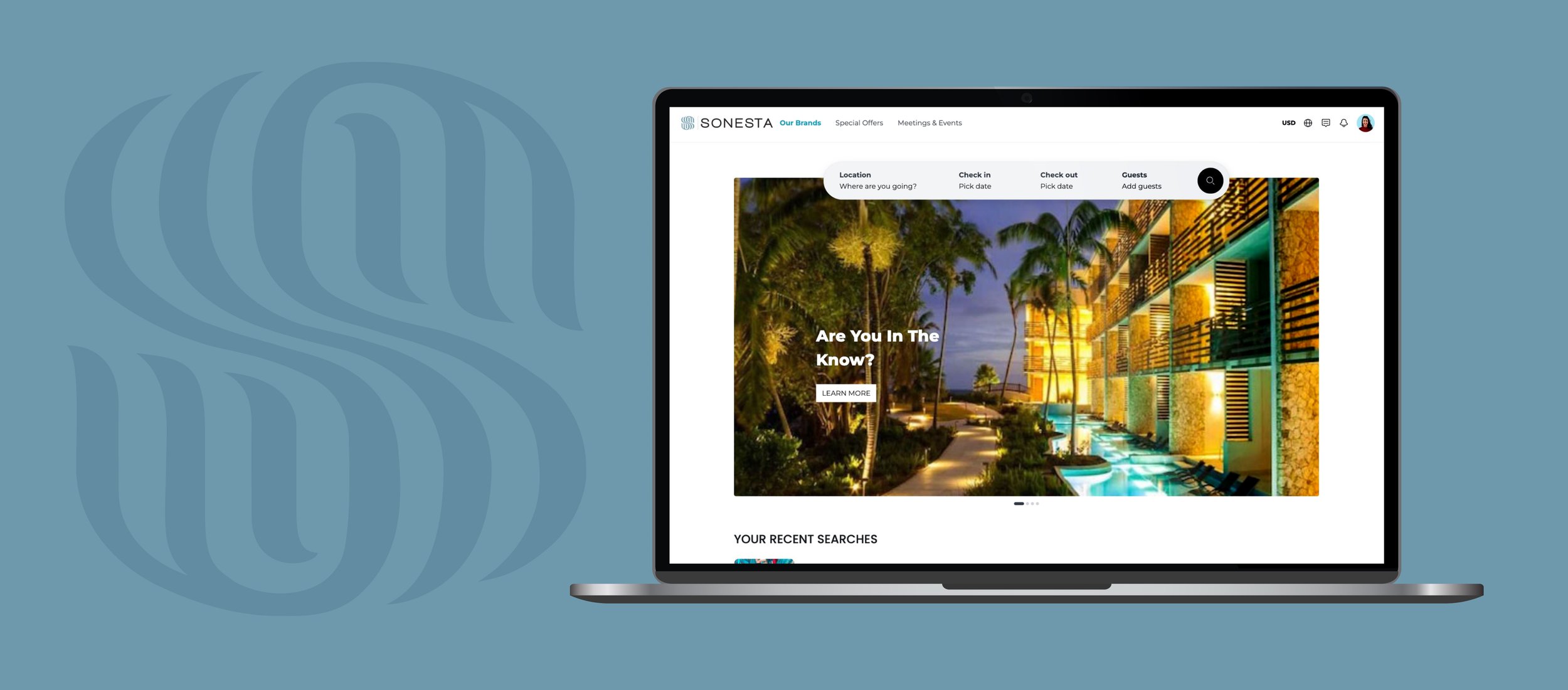
An efficient and user-friendly search system can streamline this journey, making it easier for potential customers to find what they want. Focusing on the user's needs and pain points, this redesign transformed the search functionality into a powerful asset for Sonesta Hotel.
SONESTA SEARCH
The Sonesta Hotel, a renowned name in the hospitality industry, recognized a critical need to revamp its search functionality on its website. The existing system was outdated and cumbersome, leading to a decline in user engagement and, consequently, bookings. The primary objective of this redesign project was to create an intuitive, efficient, and responsive search feature across various devices, including mobile phones and tablets. The hotel aimed to elevate the overall user experience, thereby increasing the likelihood of completed bookings and customer satisfaction.
The project was not just about aesthetic changes but a strategic move aligned with Sonesta's broader business goals.
ROLE
User Experience (UxR) Researcher, User Experience (UX) Designer, Interaction (IxD) Designer, User Interface (UI) Designer, and Visual Designer
TIMELINE
Three months (ongoing)
TOOLS
Figma, Illustrator, Photoshop
Opportunity
The existing search functionality of the Sonesta Hotel's website presented a significant user experience challenge that directly impacted customer engagement and, consequently, bookings. A competitive analysis revealed that rival hotel chains offered more streamlined and intuitive search features, such as real-time availability, price comparisons, and user-friendly filters. This gap in the market presented Sonesta with a compelling opportunity to not only catch up with competitors but also to innovate in this space.
By redesigning the search functionality, Sonesta had the chance to improve user satisfaction significantly, increase the time spent on their platform, and, most importantly, drive higher conversion rates for bookings. The redesign aimed to make the search experience more intuitive, efficient, and responsive, aligning with the brand's commitment to customer-centricity.
Proposed Features:
Autocomplete Suggestions: As users type in the search bar, relevant suggestions appear to expedite the search process.
Filter and Sort Options: Users can filter results by room type, amenities, price range, etc., and sort by relevance or price.
Responsive Design: The search functionality adapts seamlessly to mobile and desktop interfaces.
Quick View for Room Details: Users can hover or click on a room option to see essential details without navigating away from the search results.
Design Approach:
Simplicity: The design aims for a clean, uncluttered interface with intuitive navigation.
Efficiency: Every design decision is geared towards making the search process faster and more straightforward.
Responsiveness: The design adapts to various screen sizes and orientations.
Agile Methodology: The project uses Agile for iterative development, allowing quick pivots based on feedback and testing.
Integrating a redesigned search functionality with Sonesta's brand would offer a seamless, efficient, and personalized user experience. Aligning Sonesta's commitment to quality and customer satisfaction enhances usability and engagement. The upgrade would make room selection more intuitive and reinforce the brand's reputation for reliability and forward-thinking. Ultimately, this fusion aims to elevate the digital customer journey, driving higher engagement and revenue while staying true to Sonesta's core values.
Research
The project's research phase was critical to gathering empirical data to inform design decisions. A competitive analysis was conducted to benchmark against other hotel websites, and indirect competitors, revealing gaps and opportunities in Sonesta's search functionality. User surveys were deployed to understand specific pain points, such as the lack of filters and difficulties in navigation. A/B testing was also employed to compare new design elements against the old ones, providing quantitative data on user preferences and behaviors.
Findings
Intuitive UI: Simplify the user interface to make it more intuitive. Both your findings and competitive analysis stress the importance of an intuitive UI.
Filter Options: Introduce more extensive and intuitive filters. The lack of filters was a significant pain point in your findings, and competitors offer rich options.
Speed Optimization: Optimize the search function to return results more quickly. Speed was a noted strength among competitors like Hyatt.
Mobile Responsiveness: Ensure the design is fully optimized for mobile use. The findings indicate mobile users had difficulty, and competitors show the importance of this.
Unique Features: Consider adding features like 'Book Now, Pay Later' or package deals. The competitive analysis shows that special features could offer a competitive edge.
Balanced Information: Provide essential information without overwhelming the user. Competitors like Hotels.com show the risk of overwhelming users with too much information.
Cultivating User-Centric Empathy
In this project, two primary personas were meticulously developed: the Business Traveler and the Leisure Traveler. These personas were not mere demographic profiles but were imbued with psychographic elements like motivations, pain points, and emotional triggers. The Business Traveler, for instance, prioritized efficiency and minimal clicks, while the Leisure Traveler sought rich content like photos and reviews.
These personas served as the North Star for design decisions, ensuring that the redesigned search functionality would resonate emotionally and practically with these distinct user groups. By understanding these personas deeper, the design process became more empathetic, focusing on real user needs rather than abstract functionalities. This empathy-driven approach led to more intuitive and user-centered design solutions, ultimately contributing to higher user satisfaction and engagement with the new search feature.
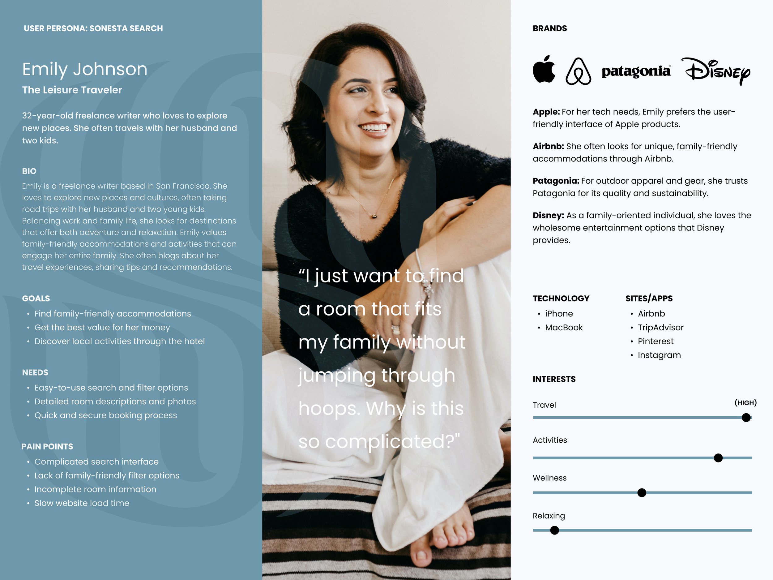
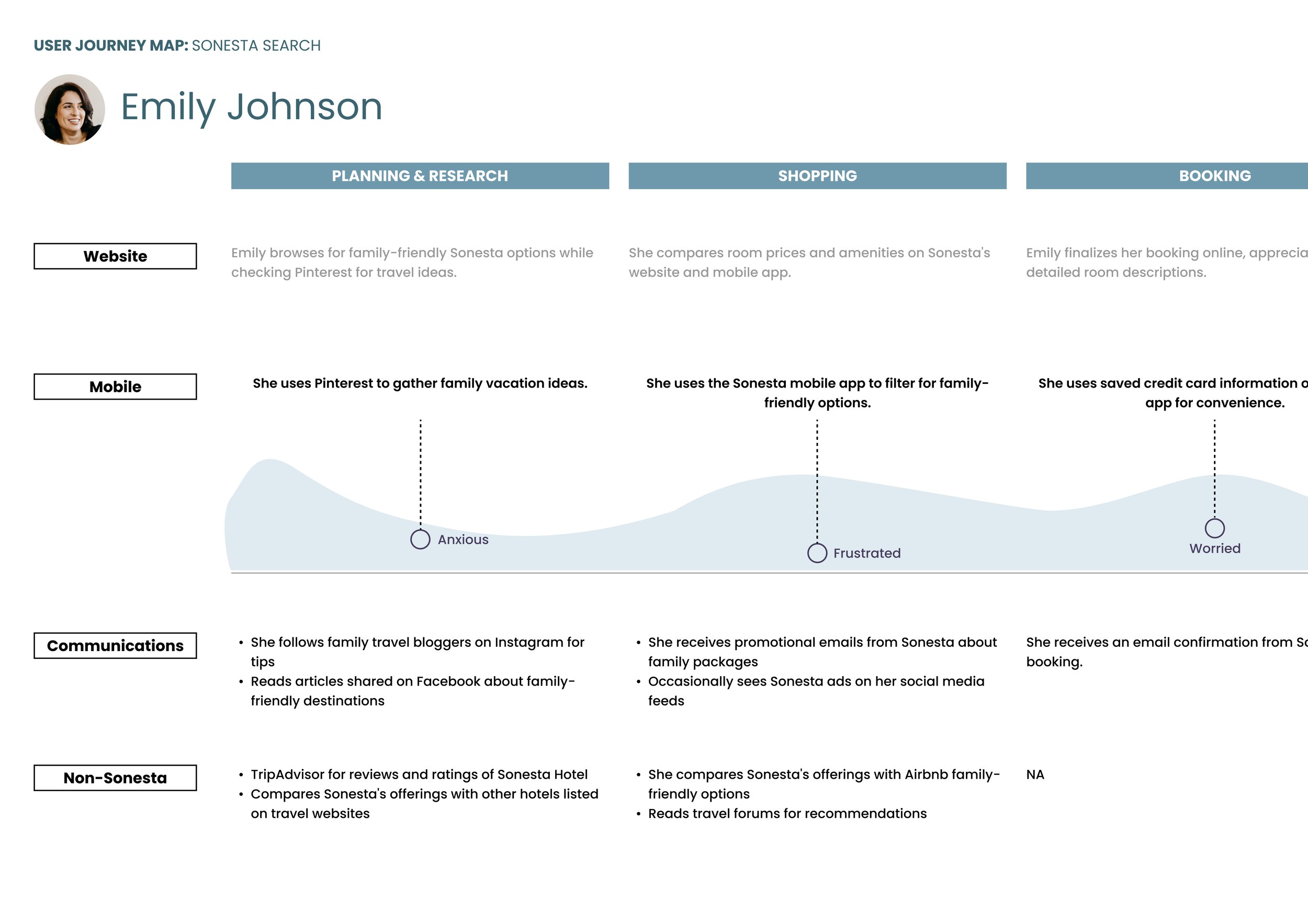
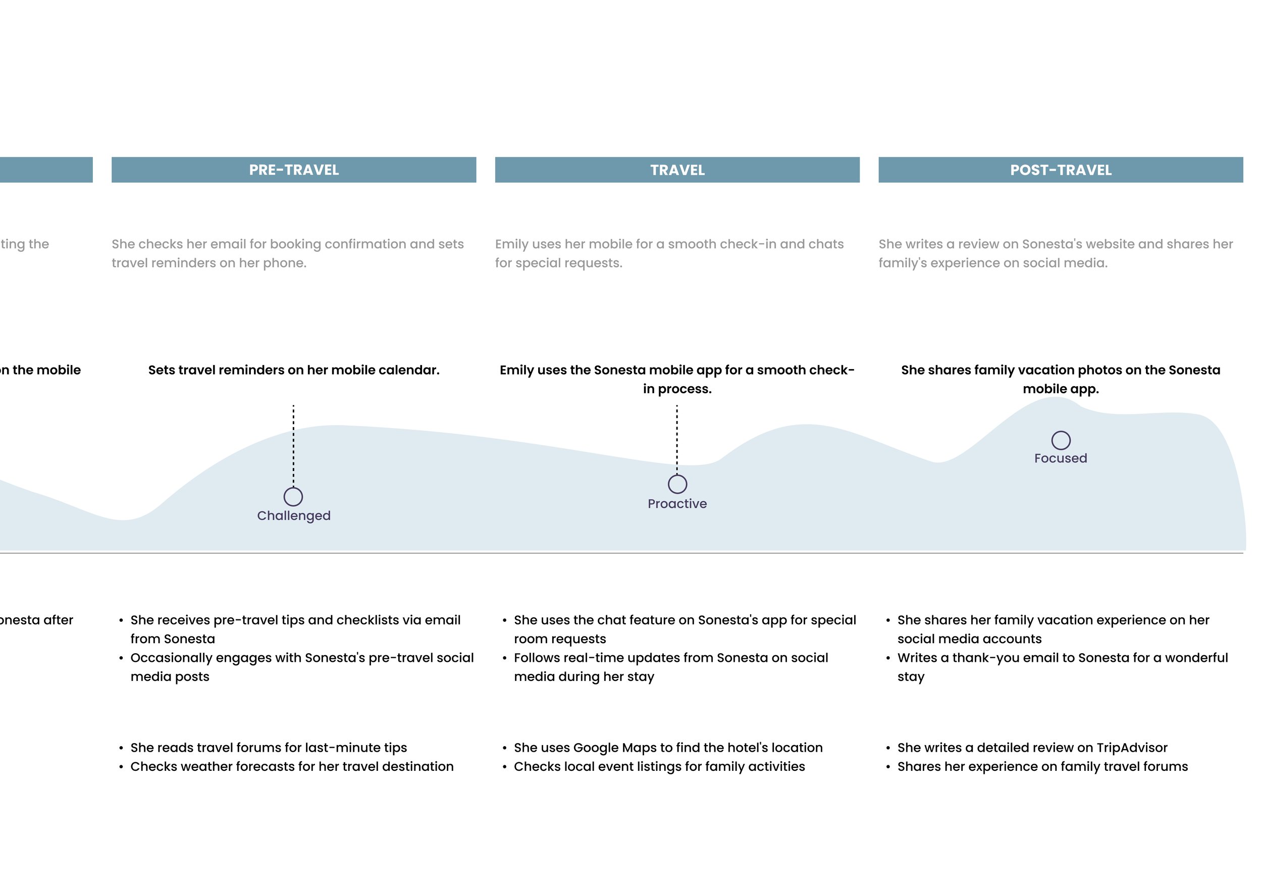
Emily Johnson The Leisure Traveler
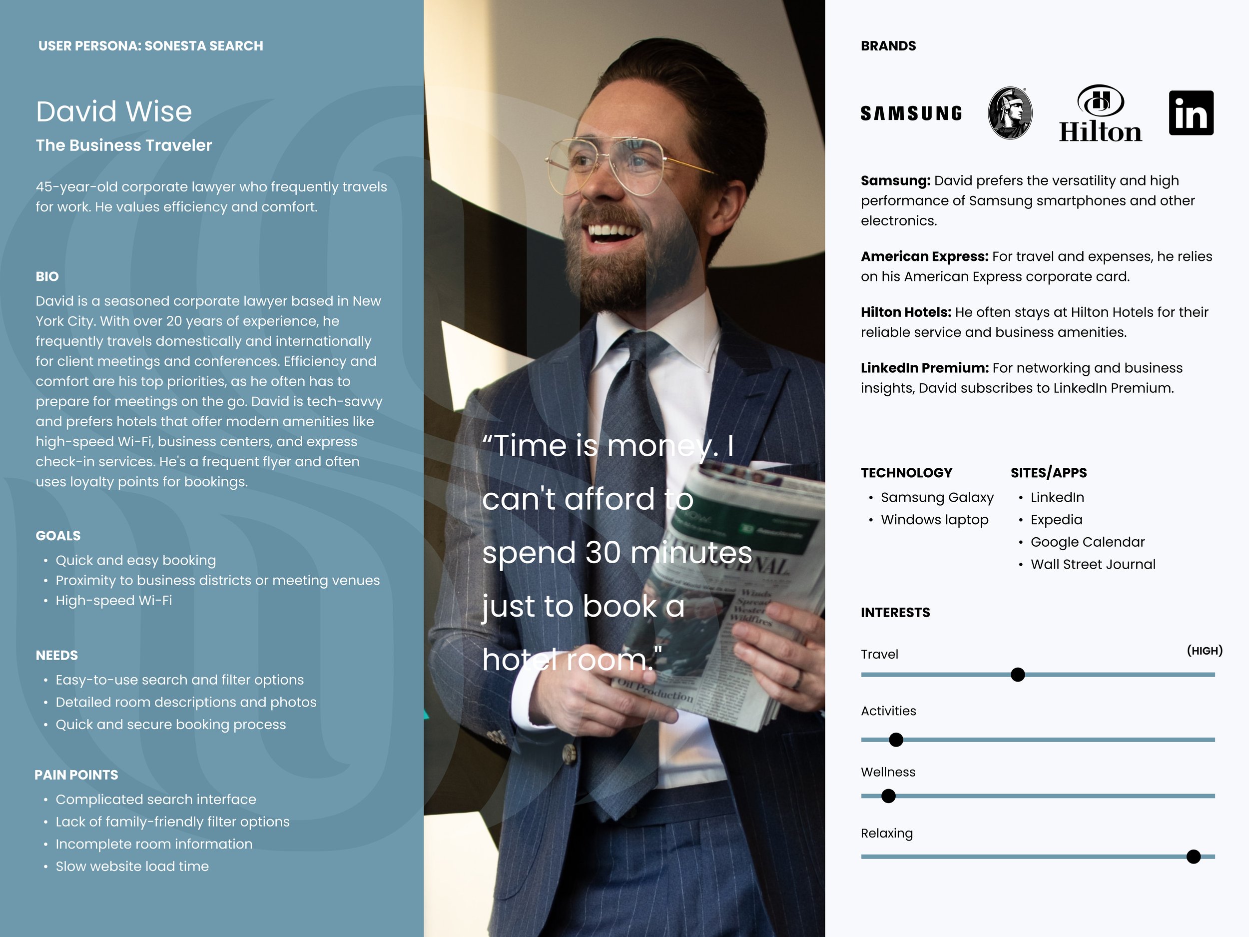
Davis Wise The Business Traveler
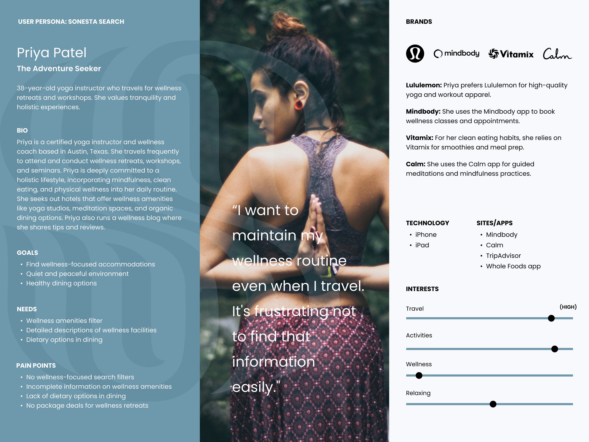
Priya Patel The Adventure Seeker
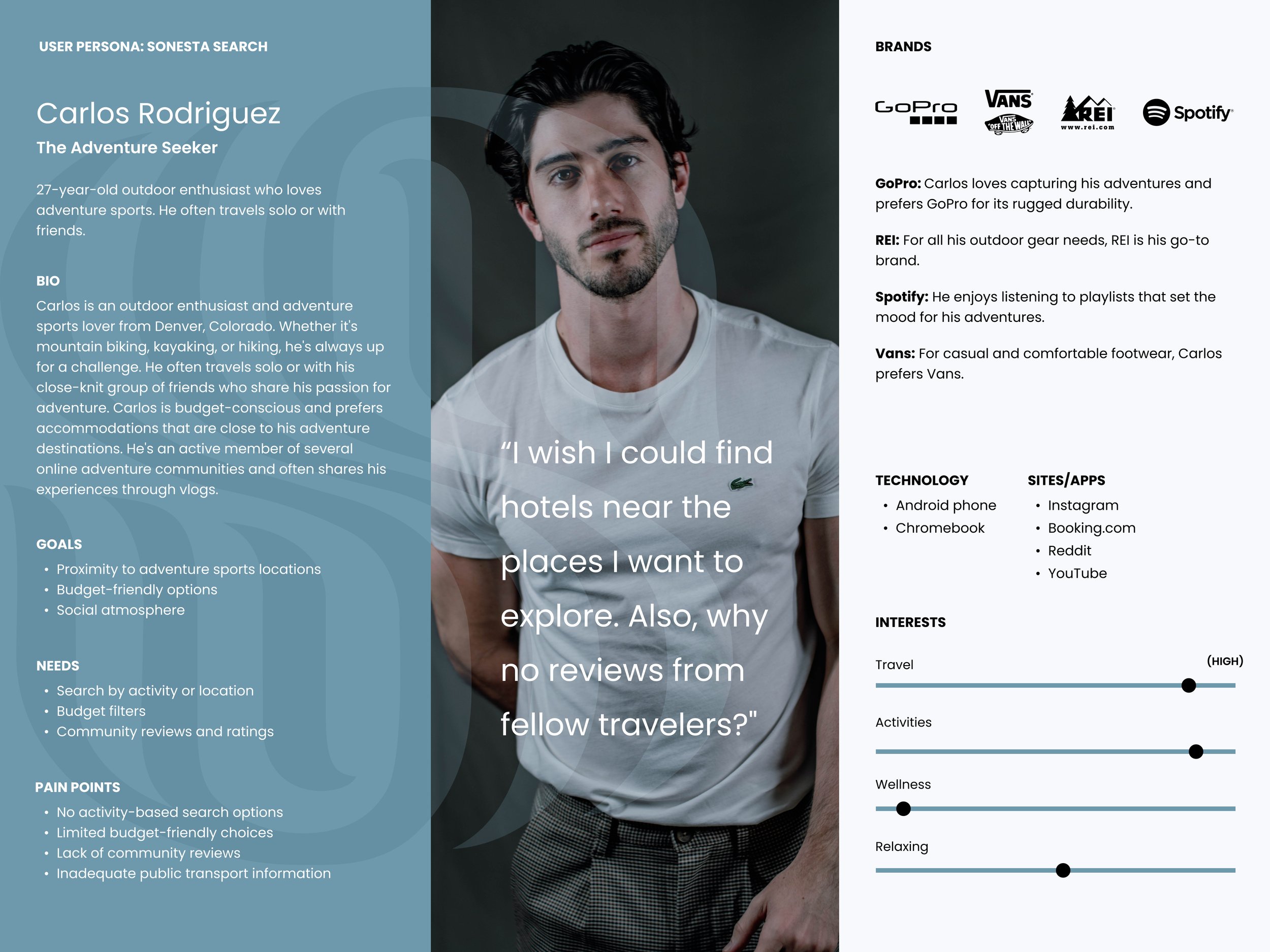
Carlos Rodriguez The Adventure Seeker
Unpacking the Customer Journey: Key Touchpoints and Opportunities
Here, we'll develop comprehensive Customer Journey Maps for each identified user persona, such as Emily, our Leisure Traveler. These maps will visually encapsulate Emily's entire spectrum of interactions with the Sonesta website—from the initial planning stage to her post-travel reflections. We'll pinpoint crucial touchpoints, emotional triggers, and potential areas of friction. This exercise is pivotal for us; it provides a 360-degree view of the user's journey and uncovers actionable insights for refining our search functionality. Adopting this empathetic lens ensures that our redesign efforts are genuinely user-centric.
Defining Crucial Workflows
Users expressed that once an invoice is issued or received, they want a streamlined way to monitor its payment status. Priority is given to real-time updates and the ability to access this information from the Policy Connect landing page easily. This workflow illustrates that simplified and direct journey.
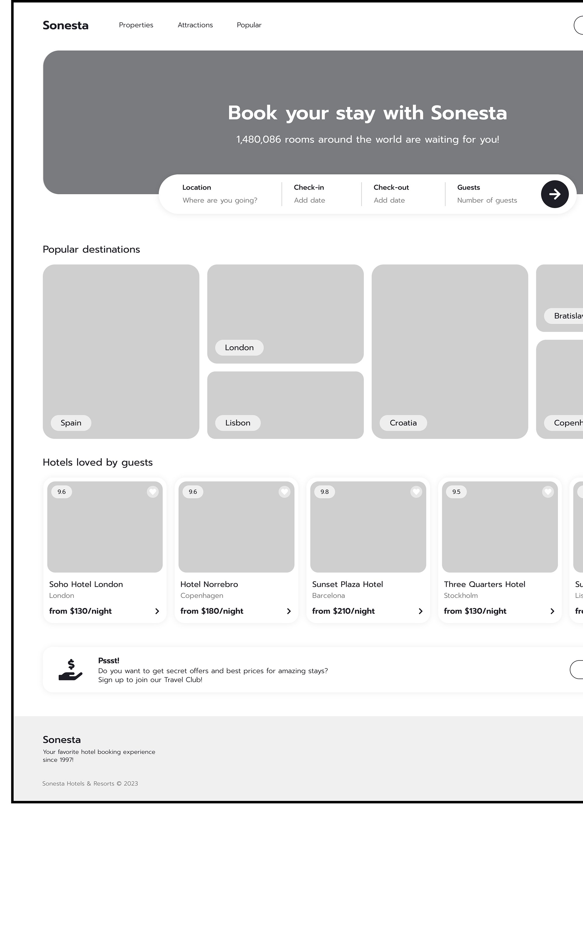
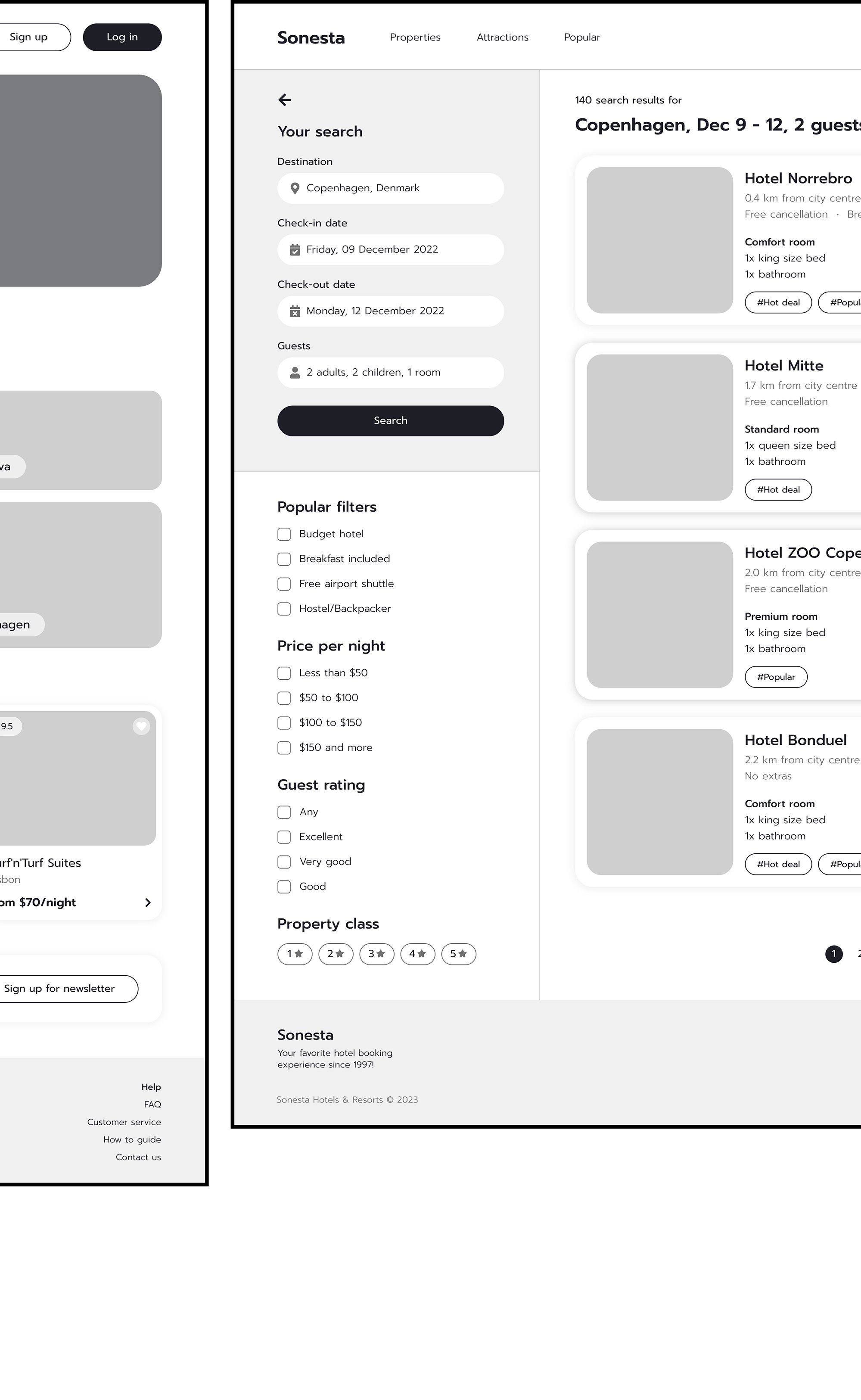
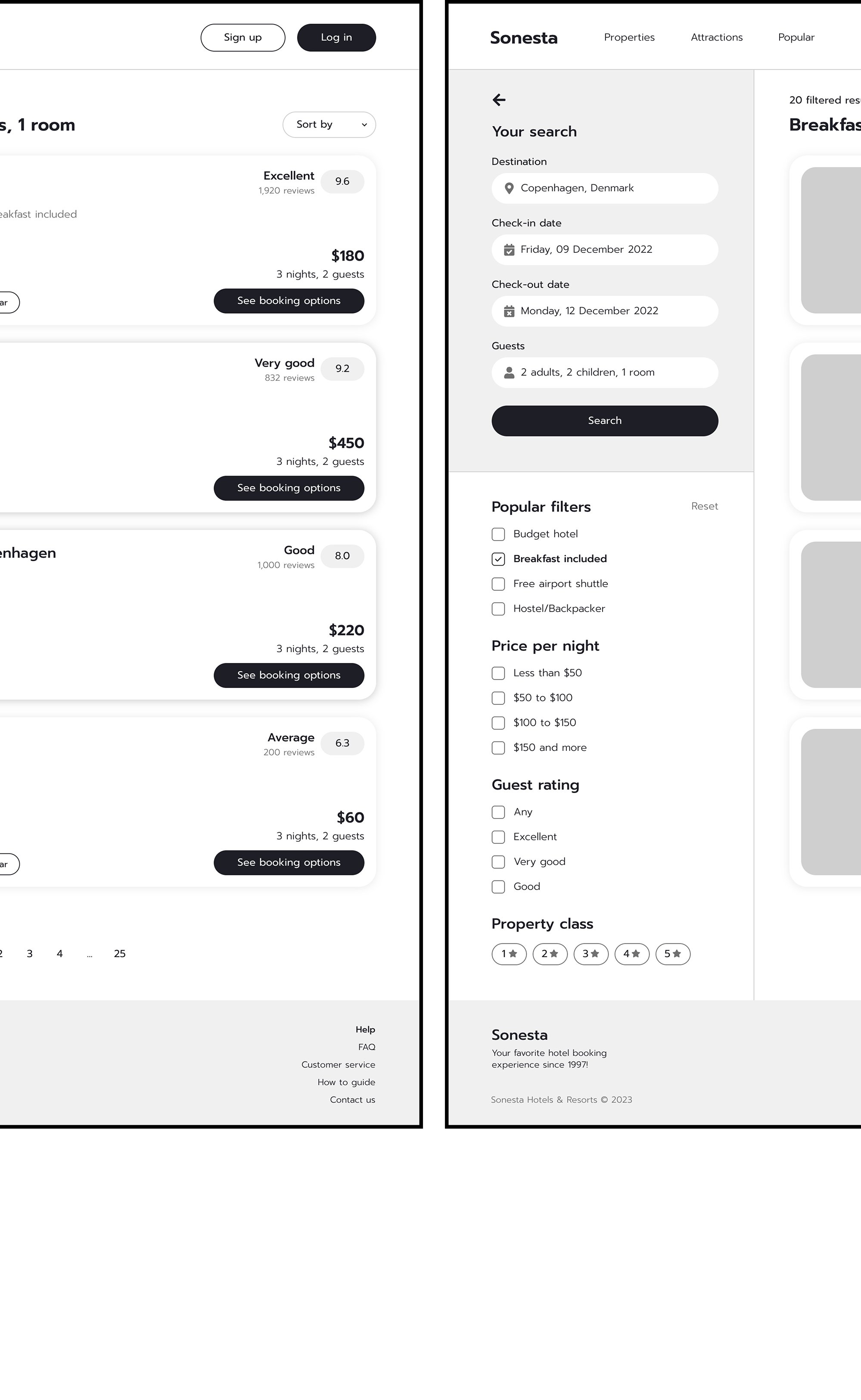
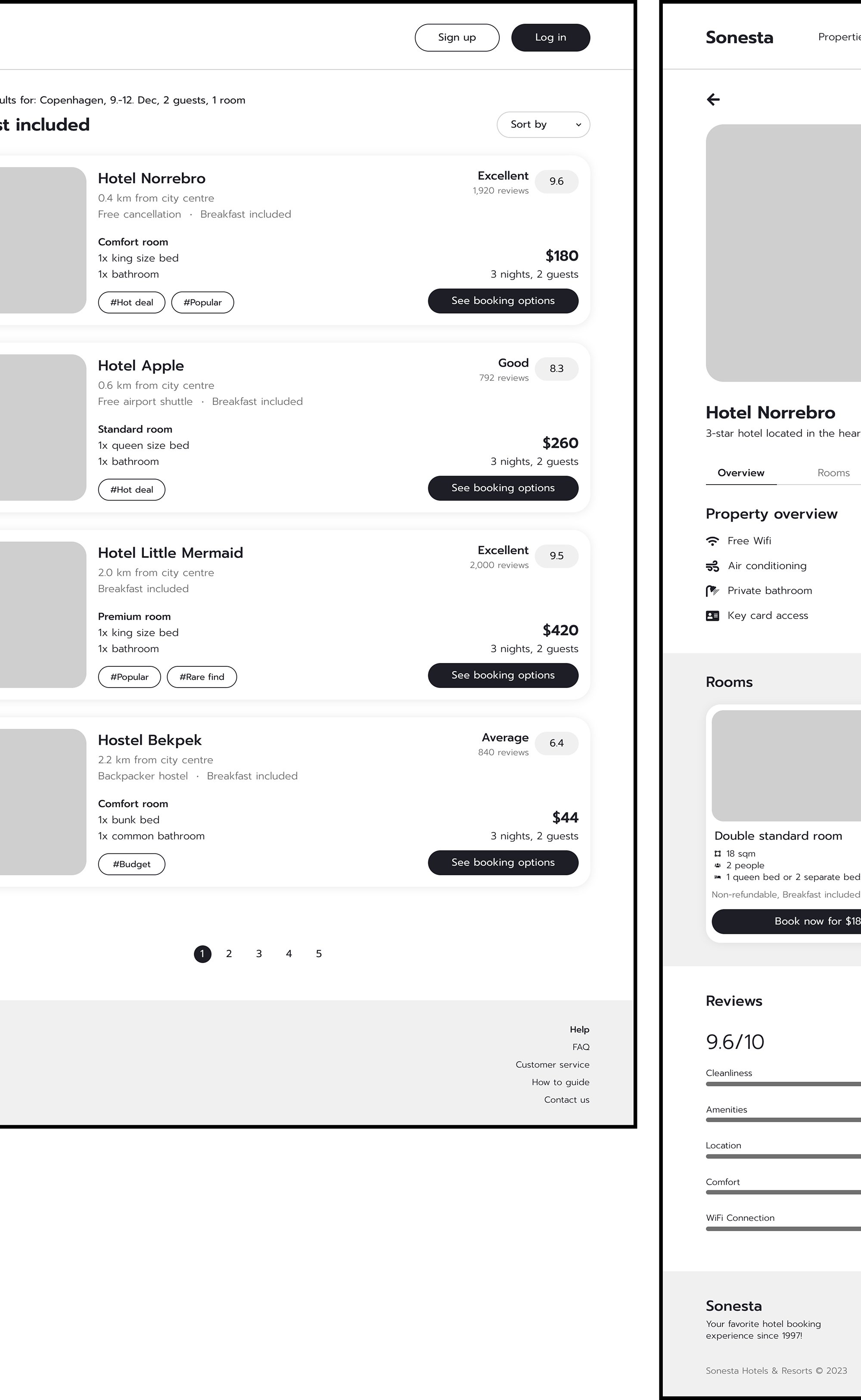
Uncovering User Pain Points: A Greyscale Prototyping Method for the Sonesta Search Functionality Redesign
Faced with a three-month project timeline, I transitioned swiftly from initial sketches to high-fidelity, greyscale prototypes. Using a monochromatic design palette, this focused approach was instrumental in identifying potential issues related to scale and information hierarchy within the search functionality. The absence of color allowed me to concentrate on the structural elements, removing any distractions caused by aesthetic considerations.
Critical choices were made in this greyscale setting to prioritize essential design elements. The simplified color scheme made it easier to decide which features, such as filters and call-to-action buttons, needed to be more prominent while relegating less crucial elements to the background. This approach optimized the use of space, making the interface more intuitive and user-friendly.
User testing of these greyscale wireframes revealed specific pain points. Users found certain terminologies confusing and had particular functional expectations that the initial design did not meet, such as the absence of a "Family-Friendly" filter. These insights were invaluable, underscoring the limitations of a compressed prototyping timeline and highlighting the necessity of iterative feedback for refining the design to meet user needs and expectations better.
So What Happens Next?
There’s work to be done. The following steps in the Sonesta Hotel Search Functionality Redesign project aim to refine and validate the design based on insights gained from user testing and greyscale prototyping. These action items focus on addressing identified pain points, optimizing user experience, and preparing for a seamless transition to the development phase. Each step is crucial for ensuring the final design is user-centric and effective.
Refine Greyscale Prototypes
Update the high-fidelity, greyscale prototypes to incorporate user feedback.
Why: User testing revealed specific areas that need refinement.
How: Revisit the wireframes and make adjustments to confusing or ineffective elements.
Implement "Family-Friendly" Filter
Add a filter for family-friendly options in the search functionality.
Why: This was a significant user need not met in the initial design.
How: Work with developers to add this filter and test its functionality.
Revise Terminology
Simplify and clarify the language used in the interface.
Why: Users found specific terms confusing.
How: Review all text elements and replace jargon or unclear terms with straightforward language.
Conduct A/B Testing
Perform tests on different versions of the search functionality.
Why: To validate that the design changes effectively address user pain points.
How: Create two or more versions with slight variations and monitor user interactions to determine which performs better.
Optimize Information Hierarchy
Reassess the prominence and placement of various design elements.
Why: The greyscale prototyping phase highlighted scale and information hierarchy issues.
How: Use the insights from the greyscale prototypes to rearrange elements for better usability.
Second Round of User Testing
Conduct another round of user testing with the refined design.
Why: Iterative feedback is essential for fine-tuning the design.
How: Use the same user testing methods as before but focus on areas that have been refined.
Finalize Design
Incorporate all feedback and test results to finalize the design.
Why: To ensure the design is as effective as possible before development.
How: Review all feedback and make final adjustments, then get approval from stakeholders.
Prepare for the Development Phase
Create a handoff document and prepare all design assets.
Why: To ensure a smooth transition from design to development.
How: Compile all design files, user flows, and specifications into a comprehensive handoff document.
Post-Launch Analytics
Set up metrics and KPIs to monitor after the launch.
Why: To assess the effectiveness of the redesign and identify areas for future improvement.
How: Work with the analytics team to establish KPIs and set up tracking mechanisms.
Two Decades of Learning

Even after two decades in UX design, the Sonesta Hotel Search Functionality Redesign project has reaffirmed the ever-evolving nature of the field. While the project is ongoing, it has underscored the perpetual importance of user-centric design, revealing the nuanced challenges of working within compressed timelines, not just for the design process but also for development teams, and emphasizing the indispensable value of iterative feedback. These lessons serve as both a humbling reminder and an inspiring catalyst for continuous learning and adaptation in future projects.
User-Centric Design is Crucial:
The initial absence of a "Family-Friendly" filter and confusing terminology highlighted the importance of deeply understanding user needs and pain points.
Implication: Future projects should invest more time in initial user research to build a genuinely user-centric design from the ground up.
Limitations of Compressed Timelines:
The three-month project timeline led to a fast-tracked prototyping process, which, although efficient, had limitations in addressing all user needs.
Implication: While tight deadlines are often unavoidable, it's essential to be aware of the trade-offs and limitations of accelerated timelines.
Necessity of Iterative Feedback:
The user testing phase was invaluable in highlighting areas for improvement, emphasizing the need for multiple rounds of user feedback throughout the design process.
Implication: Iterative testing and feedback loops should be integrated into the project timeline to allow for fine-tuning and validation of the design.